

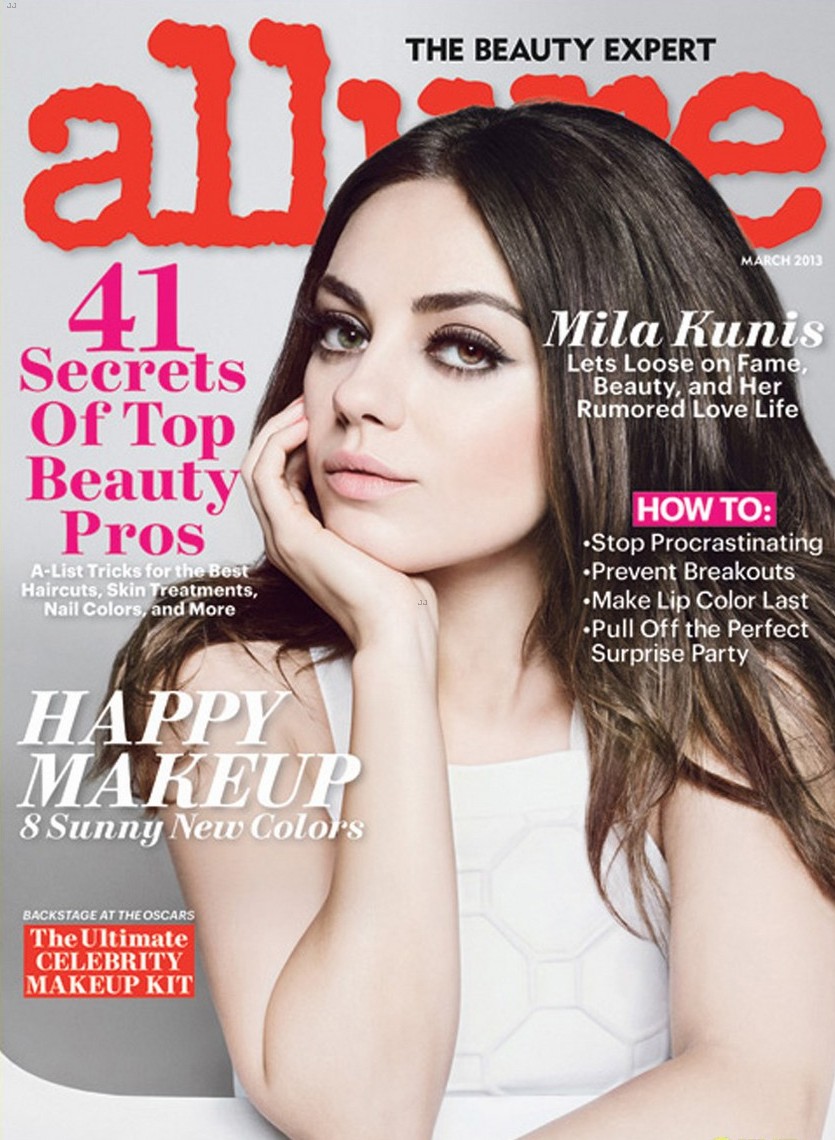
The same goes for beauty magazines, the covers usually include a woman posing very simply with a bold masthead and cover lines around them. The beauty magazine are more focused on the face though, which allows me the ability to do something more creative with the makeup on my model's face. But, it is still so simple for me when it comes to the colors and the kinds of cover lines that are expressed. The second cover I looked at was more my style in terms of the colors and the creativity in the look that is conveyed on the model's face. This one made me want to lean towards beauty but I am still exploring my options.

Finally, I looked at fitness magazine covers which are such a stark difference in comparison to fashion and beauty magazines. I liked the first cover a lot because rather than a person just posing looking "good", there is also an interesting background. The second cover also appealed to me because of the matching colors throughout the image and the masthead/cover lines.
No comments:
Post a Comment